4 Results
This section demonstrates how results generated by your analysis can be integrated into the narrative. It showcases the use of Quarto’s embed feature to include outputs from separate analysis scripts.
Remember that the dynamic document’s (.qmd) primary role is to present the narrative and key findings. Complex or exploratory analyses are best kept in separate scripts within the Scripts/ directory. This separation keeps the main narrative document focused and clean.
The Scripts/AnalysisScripts/data_visualization.qmd file contains example R code for generating plots and tables. Below, we embed the outputs from specific code chunks within that script directly into this narrative.
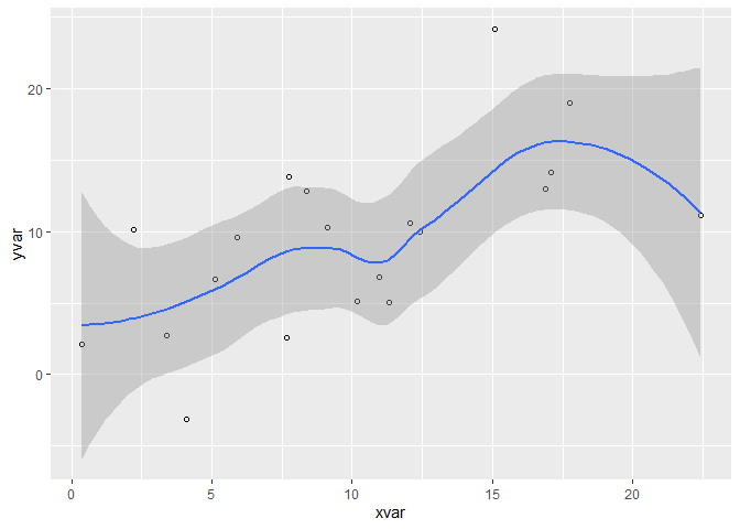
I’ve included two examples of how to include results from your analytic scripts into your story below: Figure 4.1 and Table 4.1. These are generated by running the code in Scripts/AnalysisScripts/data_visualization.qmd.
To learn how it was done, follow the code in Scripts/AnalysisScripts/data_visualization.qmd! Please take note that we are only referring to the output (the figure and table) generated by the code chunks labeled fig-pressure and tbl-diamonds in that script. The underlying R code is executed when that script is run or when this document embeds its output, ensuring reproducibility.
This approach allows you to develop complex analyses in dedicated script files while selectively presenting the most relevant results in your main article narrative.
To learn more about the embedding process discussed here, see the Quarto embedding documentation.
Tip
It should be noticed that the rendered PDF copy of this article does not include the video that appears on the website’s homepage, as well as this tip. Our use of the markup block ::: {.content-visible unless-format="pdf"}::: is the cause of this. You can leave the PDF as is to submit it to the journal while displaying extra components in the dynamic document. Learn more at the Quarto conditional content website.